Friday, February 29, 2008

Oh, to not be Latin...

I am of two minds when it comes to letters: on the one hand, I love our alphabet and the world of Western typography in which I reside (clearly, I teach it), but sometimes that same world can feel incredibly unimaginative. I first saw non-Western, calligraphic writing when I was 16 during a tour of the Alhambra in Cordoba, Spain. Every inch of the Moorish palace is hand-carved with ancient Arabic writings, most from the Qur'an. 

I think the wonderful texture and fluidity of that typography have been in me ever since.


I have my students designing a magazine spread, dealing with grids and heavy text coverage but also integrating hand-drafted elements into their design. Its a effort to keep the grid from controlling their design and turning it into a rigid, lifeless mess. I was starting to actually question my decision (about the relevance of hand-drafting in the world of heavy text) when I ran across this article on the Hoefler & Frere-Jones blog.


Its all about the world's last handwritten newspaper, The Musalman. What a wonderful reminder that hand-drafted type is not only alive and well but still considered highly applicable, in some parts of the world, for the design of heavy text. I forwarded it on to my students, we'll see what they make of it. In the meantime, I'll continue dreaming about the day I'm able to write in a non-Latin language... 


Wednesday, February 27, 2008

Unintended Uses


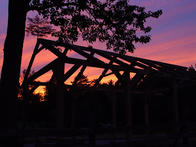
Originally conceived as a simple replacement to an unsightly Kwansit tarp hut, The Shed, as it has come to be called, has taken on many additional functions beyond simply shielding the tractor from the elements. Much of the design was based on the fact that the entire structure had to be built by two people - my dad and myself - with very basic tools, and to reduce as much labor and waste material as possible. Even the detail of the rafter tails with sloping V's was based on the fact that our circular saw could only cut halfway through the beam. Two cuts were required and if they weren't straight it would never line up. 

Polycarbonate roofing was intended to not only bring natural light into the space but was a labor saving decision. The plastic roofing was much easier and safer to handle and cut than traditional metal roofing. Adding clear siding restored the clear view from the front of the house to the garden. All this light made the space an ideal workshop and now the back third of the shed is an officially that, complete with concrete pavers providing a hard floor and additional benches built into the simple wood frame walls. In the summer the space is used so much that the tractor is rarely parked inside. The overhang in the back created a small porch that became a place to sit and view the garden as well as a place to keep garden tools out of the rain. 

My first attempt at creating real built architecture will now make an ideal altar for *girl's and my upcoming wedding.


Maybe we'll move the garden hose and bucket for the big event...

Tuesday, February 26, 2008

A Shed for All Seasons

Although we haven't yet made many decisions about our Big Day, "location" can be checked off the list. Weather permitting, the shed's porch will serve as our altar.

Summer


Sunset


From the Garden


Winter


Fall, Season of choice for the Big Day


Tuesday, February 19, 2008

Drawing an Imitation

I don't know if this is by the same artist (I don't think it is) but I came across it and thought it would make an interesting addition to *boy's earlier post.


I don't know if this was done as an imitation of Peter Callesen's work. Maybe this designer originated the idea and it just happens to be one of those coincidences where two designers come up with the same concept. Maybe this was designed by Callesen. Regardless of the author issues, isn't it interesting how our perception of the design changes when the design changes context. The first work is presented in a void of the artist's own making: solid color field, intentional lighting and an absence of scale.

The second gives us far more information because of its literal surroundings and yet this additional information seems to limit the design's interpretation. The "meaning" has been decided on by the type and the context: it is an advertisement for a self-help organization. The first remains untethered and open for our own opinion, our own ideas.

Where is the line between art and design? Between beauty and advertising? Does the human race really need everything spelled out in black and white? Why can't negative space say everything that need be said? I'm in the process of working with my type students on this very idea. Its a tough one...

Friday, February 15, 2008

Drawing a Blank


I helped *girl design a sleeve for sketchbooks before Christmas that had little pop-up trees to go along with the theme of the all new sustainable and recycled sketchbooks that she put together for our office. I wish we had seen this work when we came up with it.
The artist...


Wednesday, February 6, 2008

Man vs. Wild


When I first saw the renderings of this building I immediately thought about blowing bubbles in chocolate milk as a kid. As a designer I guess inspiration can come from anywhere and sometimes the most unexpected things yield fantastic results. I’ll let the engineer and architects describe it as it may seem like a simple concept but the execution required some serious thought….

Its structural design is based on the most effective sub-division of three-dimensional space – the fundamental arrangement of organic cells and the natural formation of soap bubbles. This naturally-occurring arrangement contributed to this seeming random generation of structure, but it is in fact a solution that is extremely repetitive and highly buildable - removing the usual architectural inspiration that defines extreme geometry in building design, thus nature beats technology.

The design of the Water Cube is derived from theoretical physics, and the steel frame that encompasses this aquatic centre is based on what is known as the
Weaire-Phelan structure, which describes the most efficient way to divide space. This is in fact the same way that bubbles form in foam. Whereas soap bubbles can be divided into two shapes - three quarters of the cells have 14 sides and the remainder have twelve - the engineering solution to make the Water Cube a reality requires over a hundred different ones. However, in spite of their seeming randomness, bubbles always touch each other with a regular geometry and it is this simple fact that makes the design feasible.


This abstraction of a natural phenomenon into a geometric form gives the building a direct relationship to nature while satisfying the rationality of human thought and order. It is this thin line that some of the most exciting and groundbreaking architecture seems to be located. It is only with a scientific and analytical abstraction that we can harness the wealth of knowledge hidden in nature to create more sustainable and interesting world.

National Swimming Centre2008 OlympicsBeijing, China
By PTW CCDI and Arup

more images here